Read the public excerpt
The same instruction and worked examples appear here and in the printable PDF excerpt. You can request full guides for upcoming units below.
READ THIS FIRST
About this guide. The current Unit 1 follows a statistical study from its question to its conclusion. You formulate the question, identify the population and variables, collect data ethically, represent and summarize one-variable distributions, and decide which conclusions the design can support. The arithmetic matters; so do the nouns attached to it. A statistic is not fully interpreted until the variable, units, and group make its meaning clear.
The task verb sets the job. Calculate requires mathematical work and a final value. Construct requires the requested table or graph with its labels. Describe says what the data show; compare puts groups in the same sentence. Interpret gives a result meaning in context, and justify supplies evidence or reasoning for a choice or claim. A bare number may complete a calculation; it does not complete an interpretation.
For the exam beginning in May 2027, Unit 1 carries 20–30% of the multiple-choice weighting. The fully digital exam has 42 multiple-choice questions in 90 minutes and four free-response questions in 90 minutes. A graphing calculator is expected throughout; the supplied reference booklet includes formulas and normal tables. The mean and sample-standard-deviation formulas are supplied, but the z-score formula and the fences are not.
If something is already going wrong, use the symptom map or The Stuck Toolkit. Both begin with the sentence you would say out loud, because that is easier to recognize than the name of a missing method.
Every topic in the unit, and where it lives. The College Board lists thirteen; here is each one and the page that teaches it.
- 1.1, 1.2 the study, its question, its variables — the first card (p. 11); Problems 1 and 9.
- 1.3, 1.4 one categorical variable, in a table and a chart — the second card (p. 12); Problem 9.
- 1.5 dotplots, stemplots, histograms — constructing a display (p. 13) and what each one hides (p. 20); Problem 2.
- 1.6 describing a distribution — the four-clause sentence (p. 18) and context (p. 19); Problem 2.
- 1.7 center, position, variability, units, outliers, and which summary to choose — five cards (p. 21); Problems 3, 4, 5, 7.
- 1.8 the five-number summary and the boxplot; mean against median — the outlier card and Problems 3 and 6.
- 1.9 comparing distributions, and z-scores as relative position — the z-score card (p. 28); Problems 6 and 7.
- 1.10 the investigative question revisited; census, experiment, observational study, confounding, generalization — study type first (p. 14); Problem 9.
- 1.11, 1.12 random sampling and its potential problems — the sampling card (p. 16); Problem 9.
- 1.13 experimental design — the experiments card (p. 17); Problem 9.
- The normal model (p. 31) and Problem 8 are Topic 2.11, kept here as a bridge because they extend this unit’s z-scores; nothing in Unit 1 is displaced by them.
How to use it. Treat the decision tree, symptom map, and Master Toolbox as a reference, not assigned reading. Route the problem, open the matching card, and attempt the prompt before reading the worked solution. The eight method-named problems make retrieval easier; the final synthesis withholds the method so choosing it becomes part of the work.
WHERE THE POINTS GO ON THIS UNIT
On the exam as it stood in 2025, six free-response questions worth 24 points, the average student earned 42.8% of them. The revised exam’s published rubric for one ten-point inference question puts one of the ten points on the calculation — the one a calculator does — and the other nine on sentences: naming the variable, the procedure, the parameter, the conditions, the comparison, the conclusion in context. Unit 1 is where those sentences are learned, and the College Board’s own notes on the unit say where they go missing.
Every one of those sentences has the same three parts: the study design it rests on, the evidence in front of you, and a conclusion that travels no further than the design allows.
The description that stops at the center. The CED, in this unit’s exam note: students “are expected to describe shape, center, and variability, as well as unusual features like outliers. A response focused only on the center, for example, is incomplete,” and students “often neglect to discuss unusual features such as gaps or outliers.” Four clauses, every time, with the variable, units and group in the sentence.
Random selection is not random assignment. “Some students write about random selection when the question refers to random assignment, or vice versa.” Selection is the word for generalizing a sample to its population; assignment is the word for a cause-and-effect claim in an experiment. A complete causal justification “cites the random assignment of treatments and does not refer to other irrelevant elements of well-designed experiments.”
Bias with a direction, confounding with a reason. Students “forget to support claims about nonresponse bias with evidence indicating whether the sample result is likely to be too high or too low,” and “need to clearly explain why a particular variable might lead to confounding.” Naming the bias is half a point; saying which way it pushes the estimate, and why, is the other half.
Both halves of a justification. “If asked to justify the selection of a particular conclusion over other options, students must include both the reasoning for their choice and rationales for not choosing the others.” Median over mean: say why the median, and say what the outlier does to the mean.
Diagnostic Decision Tree
TWO PASSES: WHAT WAS DONE, THEN WHAT IS BEING ASKED
These routes overlap. A survey can produce a categorical table, a randomized experiment can produce a dotplot, and either can end with a claim. First name how the data came to exist; then name the analysis or conclusion the prompt requests. Do not stop at the first familiar word.
1. Formulate or unpack the study. Name the population, sample, observational or experimental units, variables, and the purpose of the investigative question. A number describing a sample is a statistic; the corresponding population number is a parameter.
2. How were units chosen, and was a treatment imposed? A census records the whole population. An observational study observes without assigning treatment; an experiment imposes treatments. If sampling is in the prompt, identify the random mechanism and possible bias. If an experiment is in the prompt, identify the units, factor, treatments, response, assignment, comparison, replication, and control.
3. What kind of variable is being analyzed? Categorical variables use frequencies, relative frequencies, proportions, bar graphs, and pie charts. Quantitative variables use dotplots, stemplots, histograms, boxplots, and numerical summaries. A numeric code such as a ZIP code can still be categorical; ask whether arithmetic has meaning.
4. Individual value, one distribution, or comparison? An individual-value question may want a percentile, z-score, or stated outlier criterion. A distribution question may want shape, center, variability, and unusual features. A comparison needs both groups and comparative language; choose summaries the shapes and purpose can defend.
5. Audit the conclusion before writing it. Random selection supports generalization to the population selected from. Random assignment supports cause and effect when the analysis supplies convincing evidence. Neither one supplies the other. Without random selection, scope the result to units similar to those studied; without random assignment, do not call an association causal.
Where to Look When You’re Stuck
SYMPTOM FIRST MOVE WORKED MODEL
What is happening | First move | Where |
|---|---|---|
“I cannot name the population, sample, or variable” | Write the question in context; then inventory units, variables, parameter, and statistic. | p. 11, Prob. 1, 9 |
“My categories are counts, but the claim is a percent” | Divide every frequency by the same total; label a bar or pie display with the variable. | p. 12, Prob. 9 |
“I do not know which quantitative display to draw” | Ask whether individual values must remain visible; then choose dotplot, stemplot, or histogram. | p. 13, Prob. 2, 9 |
“I have a center but not an honest spread” | Inspect shape and unusual values; justify a resistant or nonresistant summary pair. | p. 23, Prob. 3–6 |
“The two outlier rules disagree” | Name the rule, show its boundary, and report that the criterion changes the flag. | p. 26, Prob. 3, 9 |
“I cannot name the sampling method or bias” | Locate the random mechanism first; then ask who was omitted, silent, self-selected, or influenced. | p. 16, Prob. 9 |
“I do not know whether causation or generalization is allowed” | Separate random selection from random assignment; each supports a different conclusion. | p. 14, Prob. 9 |
“I have a result but no complete response” | Return to the task verb and attach the variable, units, group, evidence, and scope it requests. | Stuck Toolkit |
Master Toolbox — Core Tools
STUDY ANATOMY AND THE QUESTION THAT DRIVES IT
A statistical study collects sample data to answer an investigative question about a larger population, especially when a census would be too large, costly, slow, or difficult.
A datum is one recorded piece of information; a data set is the collection. Before calculating, name the study’s six moving parts:
- the population (all cases of interest, size ) and the sample (the cases actually observed, size );
- the observational unit (one case on which data are recorded) and the variable recorded on each unit; and
- the parameter (a number describing the population) and the statistic (a number calculated from the sample).
A census records information from every individual in the population. A sample records only some; calling a sample statistic a population parameter does not turn it into one. Data may begin as numbers or categories, or as images, audio, video, or text from which variables are defined.
A valid investigative question does three jobs at once:
- 1.
- it guides data collection by naming the variable or variables to record;
- 2.
- it guides analysis by naming the parameter and the goal — estimate it, or test a direction such as greater than, less than, not equal, association, or not independent; and
- 3.
- it sets the possible conclusion: the population to which results could apply and, when treatments are randomly assigned in an experiment, the cause-and-effect question.
For a confidence interval, name the parameter to be estimated within a range of plausible values. For a hypothesis test, name the parameter and direction of the alternative hypothesis. Do not rewrite the question after seeing the results.
ONE CATEGORICAL VARIABLE: COUNT, DISPLAY, CLAIM
For categories, start with a frequency table. Frequency is a count; relative frequency is
and may be written as a proportion, percent, or ratio. Counts should sum to ; relative frequencies should sum to (or ), apart from rounding.
A bar chart uses separated bars whose heights are counts or relative frequencies. A pie chart uses sectors whose shares make one whole. Label the variable, categories, and scale. When comparing the same categorical variable across groups of different sizes, use relative frequencies on the same scale rather than raw counts.
Then justify one contextual claim: “In this sample, of district students favored the proposal, compared with who opposed it.” The display supplies evidence; the sampling method decides whether the claim may travel beyond the sample.
CONSTRUCTING A QUANTITATIVE DISPLAY
Choose the display by what the data and task require:
- A dotplot places one mark for every observation and is clearest for a small data set.
- A stemplot splits each value into a stem and leaf, includes a key, and preserves the original values.
- A histogram groups values into ordered bins, commonly of equal width. Its bars touch because the bins occupy adjacent intervals; individual observations can no longer be recovered.
Label the variable, units, and scale, then account for every observation. For a histogram, state consistent bin boundaries. Changing bin width or the starting boundary can change the apparent peaks, gaps, and even shape, so check more than one reasonable binning before making a strong claim.
A check first. One question opens each of the next three cards and is answered where that card ends. Answer it before you read on; getting it wrong is the point, because that is what makes the card stick.
1. SEPARATE TWO KINDS OF RANDOMNESS
A convenience sample is randomly assigned to two treatments. Which does the assignment support — a causal comparison, generalization to the whole population, or both?
STUDY TYPE FIRST; CONCLUSION SECOND
An observational study records variables without imposing a treatment. A survey is an observational study that asks people a standard set of questions. A prospective study selects units and follows them into the future; a retrospective study selects units and gathers past data. An observational confounding variable is associated with both the explanatory and response variables and offers an alternative explanation for their observed relationship. Association alone is not causation.
An experiment deliberately assigns conditions, called treatments, to experimental units; people serving as units are also called participants. The explanatory variable, or factor, has categories called levels. Those levels — or combinations of levels when there is more than one factor — are the treatments. The response variable is the outcome measured after treatment.
Keep the two randomizations separate:
| Random selection? | Random assignment? |
|---|---|---|
Question | Who may the sample represent? | Did the treatment cause a change? |
Conclusion | A random sample may support generalization to the population sampled. | A well-designed randomized experiment with convincing evidence may support cause and effect. |
Without random selection, generalize only to units similar to those who participated. Without random assignment, do not make a causal claim. One kind of randomization cannot substitute for the other.
CHECK 1 — SEPARATE TWO KINDS OF RANDOMNESS
A causal comparison, and only that. Random assignment balances the groups against each other, so a difference in response can be attributed to the treatment — for the people who were actually in the study. Random selection is what carries a result outward to a population, and a convenience sample did none of it. So the honest sentence is: the treatment caused the difference among these subjects, and whether it would do the same for anyone else is a question this design cannot answer. Two randomizations, two different jobs, and a study can have either, both, or neither.
RANDOM SAMPLES — WHICH MECHANISM DID THE WORK?
Sampling without replacement means a selected unit cannot be selected again; sampling with replacement returns it before the next draw, so it can reappear.
- Simple random sample (SRS). Every possible sample of size has the same chance of selection, usually through a random number generator.
- Stratified random sample. Split the population into nonoverlapping, internally similar strata; take an SRS within every stratum and combine the selections. Use it when representation of important subgroups matters.
- Cluster random sample. Split the population into clusters that ideally mirror the population and resemble one another; randomly select clusters and observe every unit in the selected clusters. Use it when intact groups are practical to reach.
- Systematic random sample. Choose a random starting point and then every fixed interval, such as every 20th name. Check that the interval does not align with a pattern in the list.

The same 36 units, four mechanisms. In every panel chance chose the blue units; what differs is where chance was allowed to act — across the whole population, inside each stratum, among the clusters, or once at the start.
Identification names the mechanism; justification explains why that mechanism fits this population and question.
Bias is systematic error that tends to make a statistic consistently too high or too low for its parameter. Name the mechanism and, when the context permits, its likely direction:
- voluntary response bias: only volunteers enter;
- undercoverage bias: part of the population is absent or less likely to be selected;
- nonresponse bias: selected individuals do not answer and may differ from respondents;
- response bias: recorded answers tend away from the truth, perhaps because of leading or confusing question wording bias or inaccurate self-reported responses; and
- a nonrandom convenience sample: the easiest units are chosen rather than units selected by chance.
Large reduces random sampling variation; it does not repair a biased selection or measurement process.
EXPERIMENTS — FOUR BONES AND THREE DESIGNS
A well-designed experiment rests on comparison, random assignment, replication, and direct control. Compare at least two treatment groups; a control group supplies a baseline. A control treatment may be an inactive placebo; the placebo effect is the difference between the average response to a placebo and the average response to no treatment. Random assignment aims to balance other influences across treatments. Replication means more than one experimental unit receives each treatment. Direct control keeps known settings constant.
An extraneous source of variation, or extraneous variable, can affect the response but is not the explanatory variable under study. A confounding variable is entangled with the explanatory variable so their effects on the response cannot be separated. Random assignment reduces the potential for confounding; direct control removes chosen sources of variation. In a single-blind (single-masked) experiment, participants or the interacting research team do not know treatment assignments. In a double-blind (double-masked) experiment, neither does. Masking limits expectation and measurement effects when it is possible.
Choose the design that fits the units and the important variation:
- Completely randomized design: assign treatments to all experimental units completely at random.
- Randomized block design: first group units into internally homogeneous blocks using a blocking variable; then randomly assign treatments within each block so every treatment occurs in every block. Blocking separates that source of response variation and sharpens treatment comparisons.
- Matched pairs design: a randomized block design with two treatments. Match similar units and randomly assign opposite treatments within each pair, or give each unit both treatments and randomize their order.
Three designs, one difference: where the random assignment happens — across all units, inside each block, or inside each pair. Blocking and pairing do not replace randomization; they decide the groups inside which it runs, so that a known source of variation cannot masquerade as a treatment effect.
Justify a design from the study goal, population, sample, variables, and practical constraints. Protect participants through informed consent, privacy, and avoidance of unnecessary harm. Random assignment can support a cause-and-effect conclusion; volunteer experimental units still represent only people similar to the volunteers unless they were also randomly selected from the target population.
DESCRIBING A DISTRIBUTION: THE FOUR-CLAUSE SENTENCE
When a prompt asks for a full description of a quantitative distribution, use SOCV — shape, outliers or other unusual features, center, variability — as a completeness check. Include the parts the task requests, with the variable, units, and group woven into the response.
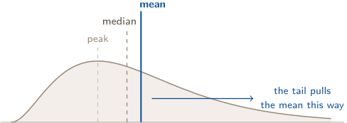
- Shape — symmetric, skewed right, skewed left, or approximately uniform; one peak or several. Skew names the tail, not the pile: skewed right means the long thin tail runs to the right, even though most of the data sits on the left. This is the single most commonly reversed word in the course, so read the picture below rather than trusting the phrase.
- Center — a typical value: the median, or the mean if the shape and purpose support that choice.
- Variability — how spread out: IQR, standard deviation, or range. A common matched choice is median with IQR or mean with standard deviation; justify the summaries from the data and purpose.
- Unusual features — potential outliers, gaps, clusters, or a second peak. State what the display supports; absence of a visible feature is not proof that none exists in the population.
Assembling the clauses is mechanical once you have them. For Problem 2, the histogram supports these fragments: shape: skewed right, one main peak; center: median in the 20–30 minute class; span: occupied classes from 0–10 through 60–70 minutes; unusual: a 50–60 minute gap and two observations in 60–70. Then write one paragraph that carries the requested features with the context attached.
CONTEXT BELONGS TO INTERPRETATION
Many common interpretations in this course use the same skeleton: the number, the variable, the unit, the group. Which pieces a response needs is controlled by the task verb. A calculation may end with a number; an interpretation must say what that number means.
Three habits that make the sentence automatic:
- Copy the prompt’s own nouns. If the prompt says “fill volumes, in milliliters, for bottles on this line,” your sentence says fill volume, milliliters, bottles on this line. You are not expected to invent language; you are expected to carry theirs through.
- Never let a pronoun do the work. “It’s higher” and “they typically vary by 5.4” are incomplete — what is higher, higher than what, 5.4 what.
- Re-read your sentence as a stranger. If it could be describing any data set on earth, it does not yet interpret this one.
Common interpretations are in the table below. The middle column records a value; the right column attaches its meaning.
Asked to interpret | Value only | Interpretation in context |
|---|---|---|
a mean | “89” | “The six students in the study group had a mean test score of 89 points.” |
a median | “312” | “Three of the seven Marlowe Street homes sold below $312,000 and three above; one sold at the median.” |
a standard deviation | “5.4” | “The six students’ test scores typically differ from the group mean of 89 points by about 5.4 points.” |
an IQR | “8” | “The middle half of the 15 checkouts spans a range of 8 days.” |
a z-score | “” | “This bottle’s fill volume is about 2.7 standard deviations below the mean fill of 591 mL.” |
a percentile | “97.5” | “About 97.5% of the bottles on this line hold 597 mL or less.” |
a comparison | “9 vs. 5” | “The median wait at South (9 minutes) is nearly double North’s (5 minutes).” |
Read down the middle column: every entry is arithmetically right. Read across any row: what the third column adds is never more arithmetic — it is a variable name, a unit, and a group. That is all “in context” has ever meant.
WHICH DISPLAY, AND WHAT EACH ONE HIDES
Every display trades detail for legibility. Knowing what each one throws away is how you pick, and how you avoid claiming something the picture cannot support.
- Dotplot — one dot per case. Keeps every individual value. Best for small ; unreadable for large.
- Stemplot — like a dotplot with the digits kept, so the original data can be read back off it. Small again.
- Histogram — values grouped into ordered bins, commonly of equal width. Bars touch because the intervals are adjacent; discrete quantitative data can be grouped too. Individual values are gone, while broad shape, center, and gaps remain visible.
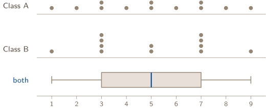
- Boxplot — five numbers and the outliers, and nothing else. Superb for comparing groups side by side; blind to everything happening inside the box.
That last point is worth seeing rather than believing. Both classes below have exactly the same five-number summary, so they have exactly the same boxplot — and they are obviously not the same distribution:
Class A spreads evenly; Class B is two clumps with a thin middle. The boxplot cannot tell you which one you have. Unequal box halves and whiskers can suggest asymmetry or skew, but a boxplot cannot establish the number of peaks or reveal the within-quartile pattern. Keep those limits attached to any shape claim.
FINDING THE MEDIAN AND THE QUARTILES — THE CONVENTION THIS GUIDE HOLDS
Median. Order the data first; nothing here is true of unordered data. Then it is a position rule:
- odd — the median is the single middle value, at position . With : position , the 8th ordered value.
- even — the median is the average of the two middle values, at positions and . With : the average of the 6th and 7th.
Note what gives you: a position, not a value. With it says “the 24th one,” and you still have to go find out what the 24th one is — which, when all you have is a histogram, means accumulating bar counts (Problem 2).
Quartiles — the convention used throughout this guide: is the median of the lower half of the ordered data and is the median of the upper half.
When is odd, exclude the overall median from both halves. With , you set the 8th value aside and take the median of the seven values below it and the median of the seven above.
Other texts or technology may include the median in both halves or interpolate, and the results can differ. That is a convention difference, not automatically an error. Use a convention stated by the prompt or technology consistently; every hand calculation in this guide uses the rule above.
2. CHOOSE A RESISTANT SUMMARY
A quantitative distribution is strongly right-skewed with one high outlier. Which pair better represents a typical value and its spread — mean with standard deviation, or median with IQR? Say why, and say what you still owe the reader.
RESISTANT VS. NON-RESISTANT MEASURES
A statistic is resistant when outliers and strong skew barely move it. Resistant: median, IQR, quartiles. Not resistant: mean, standard deviation, range.
Why the split falls exactly there. The mean uses the algebraic total of every observation, so a value far out in a tail contributes a large signed amount and moves the answer. The median is built from positions — it asks only which value sits in the middle after sorting — and a far-out value occupies exactly one position whether it is a little bigger than its neighbor or a thousand times bigger. Make the largest value in a dataset ten times larger and the mean lurches; the median does not move at all, because the ordering did not change. The same logic sorts the spread measures: the range and standard deviation are distance-based, the IQR is a gap between two positions.
The mean is the balance point. Picture the dots of a dotplot as weights on a plank. The mean is where you would put the fulcrum to make it balance — which is why one weight moved far out to the right forces the fulcrum to slide right to compensate. The median is the point with equal counts on either side, and moving a weight that is already on the right further right changes no count.
So skew drags the mean toward the tail, and that gives you a check you can run without any graph at all:

Skewed right usually has mean median; skewed left usually has mean median; and a roughly symmetric distribution often has mean median.
If the mean sits well above the median, that is evidence worth investigating for right skew or a high value, not proof of the distribution’s shape.
The conventional pairs are median + IQR for skewed data or data with outliers and mean + SD for roughly symmetric data without them. Choose and justify the pair that fits the purpose. And note what resistance is not: it is not a license to delete the outlier. The unusual value is real data. You choose a summary that isn’t distorted by it, and you mention it in the unusual-features clause.
CHECK 2 — CHOOSE A RESISTANT SUMMARY
Median and IQR. Both are positions, so one extreme value moves them very little, while the mean and the standard deviation are both computed from that value and are dragged toward it. What you still owe the reader is the outlier itself: a resistant summary is a choice about which number to report, not permission to leave the skew and the high value unmentioned. The full answer names the median, names the IQR, and then says that the distribution is right-skewed with a high outlier — which is exactly the sentence the exam is buying, and Problem 4 is that sentence with money attached.
STANDARD DEVIATION: THE FORMULA AND WHAT EACH PIECE IS DOING
The standard deviation answers one question — typically, how far is a value from the mean? Everything in the formula is in service of that sentence:
Read it from the inside out, because each layer answers an objection to the layer before it:
- — the signed deviation of one value from the mean: negative below, positive above.
- Why not just average the deviations? Because they always sum to zero when calculated from the exact mean — the positives and negatives cancel by construction. Their signed average is therefore zero and cannot measure spread. (It also makes a useful error check, allowing for a small discrepancy if the mean was rounded.)
- — squaring kills the signs so nothing cancels, and it charges far-out values more than nearby ones: a deviation of 10 contributes 100, while ten deviations of 1 contribute 10 between them. That is why the standard deviation is not resistant.
- over — the variance, . It is an average of squared deviations, so its units are the original units squared (points, mL), which is why nobody reports it in a sentence.
- rather than — because the deviations are not independent numbers. Once you know of them, the last is forced, since they must total zero. You have free pieces of information, so the sample-variance formula divides by . Under random sampling assumptions, this makes an unbiased estimator of the population variance. It does not make every particular sample representative, and itself is not exactly unbiased.
- — the square root undoes the squaring and brings the answer back into the original units, so it can be read as a distance in points or milliliters.
Notation, and the calculator’s two answers. and describe a sample; and describe an entire population. A calculator’s one-variable output lists both (divides by ) and (divides by ). Decide which one applies from the study’s population/sample definition. Problem 5 explicitly asks for a sample standard deviation, so it uses .
The free error check. Before squaring anything, add your deviation column. From the exact mean it must total zero; from a rounded mean it should be close. A larger discrepancy signals a wrong mean or subtraction. Problem 5 runs the whole computation by hand with this check.
Two facts worth carrying: is never negative, and for a defined sample standard deviation (), exactly when every value is identical.
TWO RULES FOR IDENTIFYING POTENTIAL OUTLIERS
“That point looks far away” is not a method. The current course uses two common numerical criteria, and a complete result names which one it used.
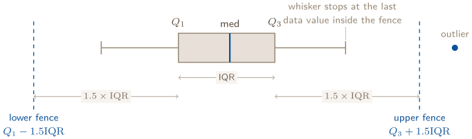
The rule uses these fences:
where , the width of the middle half of the data. Any value strictly below the lower fence or above the upper fence is flagged. Quartiles as always by the convention stated above — medians of the halves, overall median excluded when is odd.
The two-standard-deviation rule flags any value more than two standard deviations from the mean:
for sample summaries (use and for a population). Exactly two standard deviations is not more than two. Because this rule is built from nonresistant quantities while the IQR rule is resistant, the two methods can flag different observations; Problem 9 makes that disagreement visible.

For a modified boxplot built with the IQR rule, the whiskers reach only to the most extreme data values inside the fences; anything beyond is plotted as its own point. The fences themselves are not part of the finished boxplot — the dashed lines above show the computation.
Two consequences students trip over. First, a fence can land at an impossible value — a negative number of days, a negative wait time. That is fine and means only that no low outliers are possible; you do not truncate the fence at zero, you just find nothing below it. Second, the IQR rule flags values that are barely outside: a point half a minute past the fence is flagged by the same criterion as one ten minutes past. Compute the boundary instead of eyeballing.
PERCENTILES: POSITION STATED AS A PERCENTAGE
The th percentile is the value with percent of the data at or below it. It converts a raw value into a statement about rank, which is why it travels well between contexts — “97th percentile” means something to someone who has no idea what the units were.
Three ways percentiles show up in this guide:
- From counts. Count how many values are at or below yours, divide by . This is what accumulating histogram bar counts is doing — the median is just the 50th percentile, so the class holding the 50th percentile is the class holding the median (Problem 2).
- As the quartiles. is the 25th percentile, the median the 50th, the 75th. “Middle half” and “between the 25th and 75th percentiles” are the same sentence.
- From a normal model. A raw value, its percentile, and its z-score are three labels for the same relative position. The empirical rule estimates familiar whole-SD landmarks: is approximately the 97.5th percentile.
Say it as a direction, not a score. “The 90th percentile” means 90% at or below, not 90% correct and not 90% above. On a variable where small is good — wait time, cholesterol, error rate — being at the 90th percentile is bad news, and a sentence that doesn’t name the variable cannot tell the reader which situation they’re in.
Z-SCORES: POSITION MEASURED IN STANDARD DEVIATIONS
A z-score answers: how many standard deviations from the mean, and in which direction? The sign is the direction — negative below the mean, positive above — and the size is the distance. Read the formula as two moves in order: the numerator measures how far the value is from the mean in original units, and dividing by converts that distance into “number of standard deviations” by using the SD as the ruler’s unit.
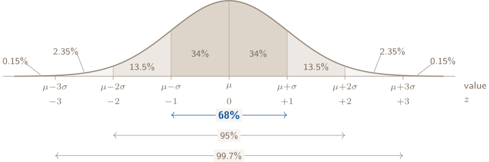
 One exam, mean 500, SD 100 — the same axis, read with two different rulers.
 That picture is the whole idea: standardizing does not move any data, it relabels the axis so that the mean reads 0 and one standard deviation reads 1. A score of 650 on this exam is at ; a score of 650 on an exam with mean 600 and SD 25 is at . Same raw number, different positions, because the rulers differ.
Because carries no units — points divided by points, mL divided by mL — it lets you compare relative positions from different distributions, which raw scores alone cannot do (Problem 7). Percentiles can be read from raw ordered data; under a normal model, a z-score is the standardized input used to calculate one.
Interpretation sentence. “” is not an interpretation. “Jordan’s fall exam score is 1.5 standard deviations above the class mean of 71 points” is — number, direction, variable, group.
LINEAR TRANSFORMATIONS: WHAT MOVES, WHAT DOESN’T
Transform every value the same way: , with .
| Add | Multiply by | |
|---|---|---|
| mean, median, quartiles | shift by | multiply by |
| SD, IQR, range | unchanged | multiply by |
| shape | unchanged | unchanged |
| z-scores | unchanged | unchanged |
The table is worth one look as a picture, because the two operations do visibly different things to a dataset:
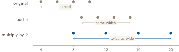
Adding slides the distribution along the axis without changing any gap between points, so every measure of spread is untouched while every measure of position shifts by . Multiplying stretches the whole picture away from zero, so centers and spreads scale together by . Shape survives both — you have relabeled or rescaled the axis, not rearranged the data.
And this is why z-scores survive both operations: the shift subtracts away in the numerator ( and both gain , so their difference is unchanged), and the stretch cancels in the ratio (numerator and denominator both multiply by ). Converting the whole class’s scores from a 100-point scale to a 200-point scale cannot change anyone’s rank, and the z-score is the number that knows it.
3. READ WHAT A PLOT CANNOT SHOW
A boxplot of a data set looks symmetric. Does that establish that the distribution is normal — and may you apply the empirical rule to it?
THE NORMAL MODEL AND THE EMPIRICAL RULE
Unit 2 bridge. In the effective-fall-2026 sequence, the standard normal distribution and empirical rule are Topic 2.11. They stay here because they extend Unit 1’s z-scores, but they do not replace any Unit 1 data-collection topic.
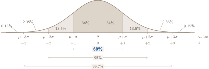
When a distribution is approximately normal — symmetric, mound-shaped, tails thinning smoothly — the empirical rule estimates the percentages within one, two, and three standard deviations as about 68%, 95%, and 99.7%. Exact normal probabilities come from the standard normal table or approved technology.
Read the figure two ways, because problems ask for both. The brackets underneath are the empirical 68–95–99.7 estimates: the approximate share of the data within one, two, and three standard deviations of the mean. The percentages inside the curve are the share in each individual band, and they are what you add when using the empirical rule for a lopsided interval like “between SD and SD.” Within that rounded model, .
One-sided tails come from halving what’s left. If about 68% lies within , then about 32% lies outside, split evenly between the two tails by symmetry — so about 16% beyond on either side. The same empirical move gives about 2.5% beyond and 0.15% beyond . Turning those estimates into percentiles is addition from the left edge: is the 84th percentile (), the 97.5th, the 16th.
Two separate decisions. First, a normal model must be justified by the prompt or distribution. If it is not, neither this figure nor a normal CDF is licensed. If normality is justified, use the empirical rule for a quick estimate at whole-SD cutoffs and a standard normal table or approved technology for more precise or non-whole z-values.
CHECK 3 — READ WHAT A PLOT CANNOT SHOW
No, on both counts. A boxplot keeps five numbers and nothing else, so it can tell you that the median sits near the middle of the box and that the whiskers are about the same length — and it cannot tell you what happens between those five numbers. Two distributions with identical boxplots can be bell-shaped, flat, or two-humped; the Toolbox figure earlier in this section shows exactly that pair. Symmetry is one of normality’s consequences, not its evidence. So the empirical rule is not licensed here: the justification has to come from the prompt saying the variable is normally distributed, from a stated model, or from a display that shows shape — a histogram or a dotplot — not from a box.
PROBLEM 1
Categorical or quantitative — the sort that decides everything
The roster spreadsheet for a high-school robotics team records, for each member: (i) T-shirt size (S, M, L, XL) (ii) jersey number (iii) commute distance to practice, in miles (iv) number of competitions attended this season (v) home ZIP code (vi) battery-pack voltage of the member’s assigned robot, in volts. (a) Classify each variable as categorical or quantitative. (b) For each quantitative variable, decide: discrete or continuous? (c) A teammate proposes reporting the “average jersey number” and the “average commute distance.” Identify which average is meaningful and justify why the other is not.
BEFORE YOU COMPUTE
The trap in this problem is the spreadsheet itself: everything in it looks numeric, because spreadsheets store labels and amounts in the same kind of cell. Don’t ask “is it a number?” — ask “if I averaged it, would the result describe anything?” That one substitution is the entire skill being tested here, and getting it wrong at this stage poisons every choice downstream, because the classification decides which displays and which summaries are even available to you.
WORKING
(a) Run the arithmetic test on each — average two of them in your head and ask whether the result could describe a real member:
- T-shirt size — categorical. The sizes have a genuine order (S M L XL), and it is tempting to treat ordered things as numeric. But S L is not a shirt, and there is no such thing as “size 2.5.” Ordered categories are still categories; the technical name is ordinal, and for AP purposes it classifies as categorical.
- Jersey number — categorical. These are numerals being used as names. Jersey 12 is not “twice” jersey 6, and the average of 4 and 88 is 46, which identifies nobody.
- Commute distance (miles) — quantitative. Twice as far is a real statement about the world, and the average of 3 miles and 7 miles is 5 miles — a distance somebody could actually drive.
- Competitions attended — quantitative. A count. Averaging counts is standard practice and the result is interpretable (“2.4 competitions per member on average”).
- ZIP code — categorical. The classic trap. A ZIP code names a place; the digits are a filing system, not a measurement. The average of 78704 (Austin) and 90210 (Beverly Hills) is 84457, which is neither a point between them nor anywhere either member lives.
- Battery-pack voltage (volts) — quantitative. Measured on a scale where the gaps mean something: the difference between 11.8 V and 12.0 V is the same size as between 12.0 V and 12.2 V.
(b) Discrete or continuous applies only to the quantitative ones — three of them here. The test: could you list the possible values, or does the variable come from measuring on an unbroken scale?
Competitions attended is discrete. Its possible values are , and there is nothing between 2 and 3. You attend a competition or you don’t; nobody attends 2.7 of them. Countable values with gaps between them discrete.
Commute distance and voltage are continuous. Between any two possible values lies another: between 4.2 and 4.3 miles is 4.25, and between 4.25 and 4.26 is 4.253. There are no gaps in the set of possible values, only in your instrument’s precision.
That last clause is the distinction students lose. Recording commute distance to one decimal place does not make it discrete. The variable is continuous; your ruler is just coarse. Ask what values the quantity can take, not what your spreadsheet happens to store.
(c) The average commute distance is meaningful: add every member’s miles, divide by the number of members, and you get a distance in miles that describes a typical trip to practice. Every step of that sentence survives translation back into the real world.
The average jersey number is arithmetic-legal but meaningless. Jerseys are labels, not amounts, so differences and a result such as 41.6 describe no member or team quantity. Arithmetic can operate on the digits; the result still answers no statistical question about the team.
ANSWER
(a) categorical: (i), (ii), (v); quantitative: (iii), (iv), (vi) (b) discrete: competitions attended; continuous: commute distance, voltage (c) the commute average — an averaged label describes nothing
WATCH OUT
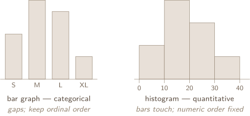
Displays follow the type, and the two bar-shaped displays are not interchangeable:
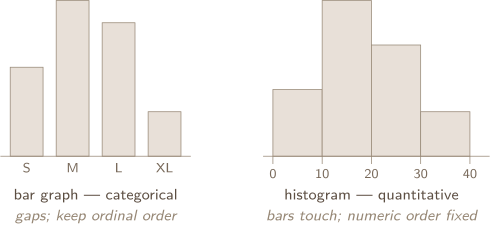
Nominal bar categories may be reordered; ordinal categories such as sizes should keep their logical order. Histogram bins cannot: numeric intervals fix the axis. Touching bars show adjacency, not continuity— discrete quantitative data can be histogrammed.
CONNECTION
The sort you just made is the first move of every later unit. Two categorical variables become a two-way table and conditional proportions in Unit 2; a quantitative variable becomes a random variable’s distribution there. In Units 3 and 4 the same sort decides the inference: categorical outcomes are questions about proportions, quantitative measurements are questions about means, and the procedures for the two are not interchangeable. A ZIP code stays a label however many digits the software shows, and a student who reads it as a number will run the wrong test on it. Name what was measured before you choose anything.
ABOUT THIS EXCERPT
This is the opening of a 53-page guide: the diagnostic tree, the full Master Toolbox, and the first worked problem. 8 more problems follow in the complete guide, each worked the same way — what to notice before you start, every step shown, and the mistake that problem invites. The complete guide is shared with families during the fit conversation.
Engineering Confidence — engineeringconfidence.one
Source and review notes
What this resource is
Complete browser edition of the public excerpt from an original Engineering Confidence AP Statistics unit-reference packet. All data sets and scenarios were created for this guide.
- Published
- Last reviewed
- Printable edition
- 24 pages
Course reference: official College Board course page.
Read this public excerpt above, or save the PDF for printing and offline reading.
Download the 24-page PDF excerpt