
Read the public excerpt
The same instruction and worked examples appear here and in the printable PDF excerpt. You can request full guides for upcoming units below.
READ THIS FIRST
About this guide. Unit 2 measured the economy — output, prices, employment — one number at a time. This unit puts the measurements into a single picture, the aggregate demand–aggregate supply model, and then asks the two questions the rest of the course turns on: where is the economy, relative to what it could produce, and what moves it.
Nearly every question in the unit is one of four moves on that picture. Something shifts aggregate demand. Something shifts short-run aggregate supply. The economy, left alone, walks back to full employment on its own. Or the government pushes it there with spending and taxes, and a multiplier says how hard the push has to be. Learn to see which of the four a prompt is asking for, and the graph draws itself.
The mistake this unit is known for. The College Board says it in this unit’s own exam note: students “conflate the aggregate demand–aggregate supply model with the market supply and demand model” from Unit 1, and label the axes “Price” and “Quantity” instead of “Price Level” and “Real GDP.” The words are not cosmetic. A market curve slopes down because buyers substitute away from one good; the aggregate curve slopes down for three aggregate mechanisms. Substitution among domestic goods does not explain aggregate demand; the interest-rate, real-wealth and exchange-rate channels do. Foreign goods can still become relatively more attractive when domestic prices rise. The second mistake the note names is the short run against the long run: the exam asks you to explain, in words and on the graph, what happens now and what happens once wages catch up — and those are different answers.
Formulas are written out before any number goes into them, because the exam gives you no formula sheet and its free-response prompts say calculate and show your work. Numbers are carried at full precision and rounded once, at the end.
Every topic in the unit, and where it lives. The College Board lists nine; here is each one and the page that teaches it.
- 3.1 aggregate demand: the curve, its slope, its shifters — card 1 (p. 14); Problem 1.
- 3.2 multipliers: MPC, MPS, the spending and tax multipliers — card 2 (p. 16); Problems 2 and 8.
- 3.3 short-run aggregate supply: its slope, its shifters, the short-run trade-off — card 3 (p. 18); Problem 3.
- 3.4 long-run aggregate supply, and what “short run” and “long run” mean — card 4 (p. 19); Problem 4.
- 3.5 equilibrium in the AD–AS model, and output gaps — card 5 (p. 20); Problem 5.
- 3.6 changes in the model in the short run — card 6 (p. 22); Problem 6.
- 3.7 long-run self-adjustment — card 7 (p. 24); Problem 7.
- 3.8 fiscal policy — card 8 (p. 25); Problem 8.
- 3.9 automatic stabilizers — card 9 (p. 27); Problem 9.
Card 10 (p. 29) is the graph itself — what a correctly labeled AD–AS diagram has on it, in the order the scorer looks.
How to use it. The pages that follow are your concept reference: a diagnostic decision tree, a symptom map, then a Master Toolbox of ten cards that carry every definition, every formula, and every diagram the nine problems use. Use the tree when you are starting a problem; use the map when you are already stuck inside one. The Toolbox is a reference, not assigned reading — open the card you need.
Then, for each problem: read the prompt, read the “Before you compute” rail, and attempt the problem yourself before reading the worked solution. Reading a solution you have not first struggled with feels like learning and mostly is not. If it is late, at minimum cover the “Working” section and predict its first line.
WHERE THE POINTS GO ON THIS UNIT
This is the largest unit on the exam — 17 to 27 percent of the score — and the College Board’s own note on it names the two places the points go. The first is the graph: the axes of an aggregate demand–aggregate supply diagram are Price Level and Real GDP, and a student who writes “Price” and “Quantity” has drawn a market, not an economy. The second is time: “on the AP Exam students will be asked to explain (verbally and graphically) the effect of policy actions and changes in economic conditions in the short run and long run and how the economy may achieve long-run equilibrium in the absence of policy actions.” Two answers, not one. In 2026, 66% of the cohort earned a 3 or higher and the bands were unusually even — no score is a safe assumption on this exam.
Label before you shift. A scorer reads the labels first: the two axes, each curve by name, the initial equilibrium price level and output, the full-employment output. Only then does the shift earn anything. An unlabeled curve that moves the right way is a picture; a labeled one is an answer.
Say which run. Every shock in this unit has a short-run answer and a long-run answer, and the long-run answer is usually “back to full employment, at a different price level.” When a prompt does not say which, it is testing whether you know there are two.
The formula is part of the answer. There is no formula sheet. Write the multiplier as , then , then , then the change in output. A bare “$250 billion” earns the number’s point and nothing for the reasoning the question was written to test.
Direction is a claim; magnitude is another. “Real GDP changes” is half an answer. Rises, and by how much, and what the price level does at the same time — that is the whole one.
Diagnostic Decision Tree
HOW TO READ AN AD–AS PROMPT
Run these questions in order, before drawing anything. Each one eliminates a family of wrong graphs.
1. Did the price level change, or did something else? If the prompt’s cause is the price level itself, nothing shifts: the economy moves along a curve. If the cause is anything else — confidence, taxes, an oil price, a technology — a curve shifts. The price level is the one thing on the axes, and a variable on the axis never moves its own curve.
2. Which curve? Ask who the cause touches. A change in what households, firms, the government or foreigners want to buy is aggregate demand. A change in what it costs to produce — wages, energy, inflation expectations — is short-run aggregate supply. A change in what the economy can produce — labor, capital, technology — is long-run aggregate supply, and usually short-run supply with it.
3. Which way? More spending or lower costs move a curve to the right; less spending or higher costs move it left. Say it as output: right means more real GDP at every price level.
4. Short run, long run, or both? In the short run, read the new intersection of AD and SRAS. In the long run, with no policy, wages adjust and SRAS moves until the economy is back on LRAS. If the prompt says “in the absence of government action” or “in the long run,” it wants the second picture drawn after the first.
5. What number is requested? A policy-induced output change under fixed-price assumptions uses a multiplier. An equilibrium from AD and SRAS equations requires solving their intersection; an output gap compares actual with full-employment output. Name the requested quantity before choosing the calculation — then report it with its sign and its unit.
6. Is the graph labeled the way the scorer reads it? Axes named Price Level and Real GDP. Every curve named. The initial equilibrium marked with a price level and an output. Full-employment output marked. Arrows on the shift. The new equilibrium named. Card 10 is that list; run it before you move on.
Where to Look When You’re Stuck
HOW TO USE THIS MAP
The tree above is for a problem you are about to start. This table is for one you are already inside. Find your sentence, do the move in the middle column, then turn to the card or problem on the right.
THE CURVES AND THE MULTIPLIER
What is happening | First move | Where |
|---|---|---|
“I don’t know whether AD shifts or the economy moves along it” | Name the cause. If it is the price level, move along; anything else shifts. | p. 14, Prob. 1 |
“I drew supply and demand” | Relabel the axes Price Level and Real GDP, then ask why each aggregate curve slopes the way it does — the reasons are different from a market’s. | |
“The tax cut and the spending increase are the same size but the answers differ” | The first round of a tax cut is partly saved. Tax multiplier ; spending multiplier . | p. 16, Prob. 2, 8 |
“I have MPC and I don’t know what to do with it” | Build the multiplier first, then multiply the change in spending or taxes, not the level. | p. 16, Prob. 2 |
“Why does SRAS slope up at all?” | Wages are stuck for a while. A higher price level with a fixed wage widens the margin on every unit, so firms make more. | p. 18, Prob. 3 |
EQUILIBRIUM, SHOCKS, TIME, AND POLICY
What is happening | First move | Where |
|---|---|---|
“Is this gap positive or negative?” | Actual minus potential, in that order. Left of LRAS is negative and recessionary; right of it is positive and inflationary. | p. 20, Prob. 5 |
“Output fell and the price level rose — which curve?” | Opposite directions means supply. Same direction means demand. | p. 22, Prob. 6 |
“Short run or long run — which graph do they want?” | Draw the short-run intersection first, then let SRAS move until the economy is back on LRAS. Say what wages did to get it there. | p. 24, Prob. 7 |
“How much spending closes the gap?” | Gap divided by the multiplier. For a tax change, gap divided by the tax multiplier — and the tax change is bigger. | p. 25, Prob. 8 |
“Automatic or discretionary?” | Did anyone have to vote? A stabilizer works through rules already on the books; discretionary policy is a new decision. | p. 27, Prob. 9 |
“My graph is right and I still lost points” | Run card 10. Axes, curves, both equilibria, full employment, arrows. | p. 29, Prob. 5 |
If none of those is your sentence, the final section of this guide is the longer version. It is organized by what went wrong, not by the vocabulary term you were supposed to remember.
Master Toolbox
Ten cards. Each one is a definition, the mechanism behind it in plain words, and the figure that carries it. Every formula the problems use is here, written to be memorized.
1. AGGREGATE DEMAND: THE CURVE, ITS SLOPE, AND WHAT SHIFTS IT
Aggregate demand (AD) is the relationship between the price level and the quantity of goods and services demanded by everyone at once — households (consumption, ), firms (investment, ), the government () and the rest of the world (net exports, ). It is Unit 2’s expenditure identity turned into a curve:
Why it slopes down. Not because households substitute among domestic goods — that is a market-level story and it cannot explain a curve for the whole economy. Foreign goods are a different matter, and the third effect below is exactly that one. The three reasons are all about what a higher price level does to the purchasing power of what people already hold:
- The real wealth effect. A higher price level makes the money and savings people hold buy less. They feel poorer and spend less ( falls).
- The interest rate effect. A higher price level means people need more money for the same transactions; the extra demand for money pushes interest rates up, and borrowing for houses, equipment and cars falls ( and fall). Unit 4 draws the money market behind this sentence.
- The exchange rate effect. Higher interest rates draw foreign funds in, the currency appreciates, exports get dearer abroad and imports cheaper at home ( falls).
Each is a movement along the curve. The price level changed; the curve did not.
What shifts it. Any change in , , or that is not caused by the price level: consumer or business confidence, wealth from asset prices, taxes and transfers, interest rates set by the central bank, government purchases, foreign incomes, the exchange rate moving for its own reasons. More spending at every price level is a shift right; less is a shift left.
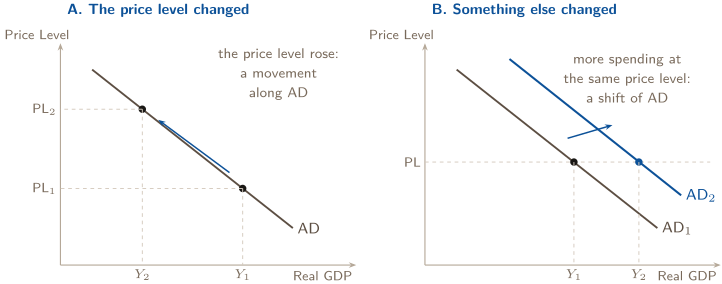
The left picture is what the three effects describe. The right is what confidence, taxes and government purchases do. Problem 1 sorts six headlines into these two pictures, and the sorting is most of the topic.
A check first. One question opens three of the cards below and is answered at that card’s end. Answer it before you read on. Getting it wrong is the point — that is what makes the card stick.
1. COMPARE POLICY CHANNELS
With MPC and the simple fixed-price multiplier assumptions, compare a $10 billion increase in government purchases with a $10 billion tax cut.
2. THE MULTIPLIERS: WHY A DOLLAR OF SPENDING IS WORTH MORE THAN A DOLLAR
When a household receives an extra dollar of disposable income it spends part and saves the rest. The part it spends is the marginal propensity to consume:
The two fractions add to one because a dollar has nowhere else to go.
The cascade. One dollar of new spending — a government contract, a firm’s new machine — is somebody’s income. They spend MPC of it, and that is somebody else’s income, who spends MPC of that, and so on. The rounds shrink geometrically and their sum is finite:
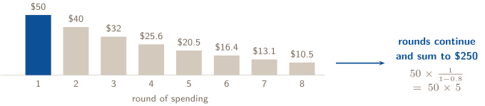
The figure is Problem 2’s numbers: $50 billion of new government spending with an MPC of 0.8. The first eight rounds already sum to about $208 billion; the whole cascade is $250 billion. The first bar is the injection; every bar after it is someone re-spending what they were paid.
The tax multiplier is smaller, and negative. A tax cut is not spending. The household that receives it saves MPS of it before the first round begins, so only MPC of the cut enters the cascade:
The sign says a tax increase lowers output. The magnitude is the spending multiplier times MPC — always one less, in fact: with MPC the spending multiplier is 5 and the tax multiplier is . A transfer payment works like a tax cut, through the same smaller multiplier.
Using them. Multiply the change in spending or taxes, never the level:
Write the multiplier out, then substitute, then compute — three lines, each one a point on a free-response question.
CHECK 1 — COMPARE POLICY CHANNELS
The purchases win, and by a fixed ratio. Spending multiplier , so $10 billion of purchases raises output $50 billion. Tax multiplier , so a $10 billion cut raises output $40 billion. The gap exists because the first dollar of government purchases is spent in full, while the first dollar of a tax cut is partly saved — only of it enters the stream. The tax multiplier is always one smaller in magnitude, and negative.
3. SHORT-RUN AGGREGATE SUPPLY: STICKY WAGES, AND THE TRADE-OFF THEY CREATE
Short-run aggregate supply (SRAS) is the relationship between the price level and the quantity of goods and services firms supply while some input prices — above all wages — are fixed by contract, custom or slow renegotiation. That stickiness is the whole reason the curve slopes up.
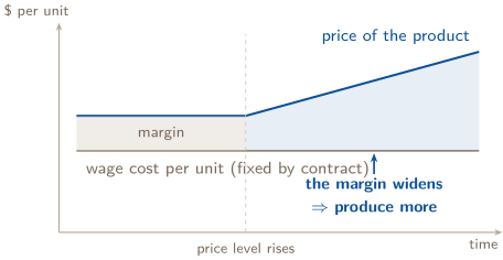
When the price level rises and the wage does not, every unit sold earns a wider margin, and firms hire the extra shift. Output rises with the price level: SRAS slopes up. Give the wage time to catch up and the margin closes again — that is card 7.
What shifts SRAS. Anything that changes the cost of producing at a given price level:
- input prices — wages, energy, raw materials (an oil shock shifts SRAS left);
- inflationary expectations — if workers and firms expect prices to rise, wages and contracts are written higher now, and SRAS shifts left before any inflation has happened;
- productivity and technology (right), and the supply shocks — harvests, disasters — that hit capacity.
A change in the price level itself moves the economy along SRAS. The test from card 1 applies to both curves.
The trade-off the slope hides. Moving up along SRAS, output rises, so employment rises; with the labor force fixed, unemployment falls. A higher price level and lower unemployment arrive together — the short-run trade-off between inflation and unemployment. Unit 5 will name that relationship the Phillips curve; it is this slope seen from the side.
4. LONG-RUN AGGREGATE SUPPLY, AND WHAT THE TWO RUNS ACTUALLY MEAN
The short run is not a number of months. It is the stretch of time during which some input prices are fixed — wages set by last year’s contract, rents on a lease. The long run is when all prices and wages have fully adjusted. That is a definition about flexibility, and the exam expects it in those words.
Long-run aggregate supply (LRAS) is what the economy produces when every price has adjusted: its full-employment output , the level at which unemployment equals its natural rate and every resource is employed at a sustainable pace. It does not depend on the price level, so the curve is vertical at .
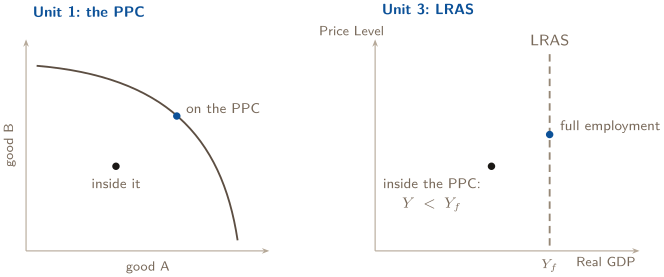
LRAS is the production possibilities curve wearing macro clothes: both mark maximum sustainable capacity. A point inside the PPC is an economy producing less than — to the left of LRAS, in a recessionary gap.
What shifts LRAS. Only what changes capacity: the labor force (population, participation, the natural rate of unemployment), the capital stock, technology and productivity, institutions. Shifts of LRAS are what economic growth means on this diagram. Anything that shifts LRAS shifts SRAS with it; the price level shifts neither.
And the trade-off? In the long run wages are flexible, so a higher price level brings no wider margin and no extra hiring. There is no long-run trade-off between inflation and unemployment; the economy sits at whatever the price level. That sentence is the vertical line.
5. EQUILIBRIUM: THE THREE PICTURES THE EXAM ASKS YOU TO DRAW
Short-run equilibrium is where AD crosses SRAS: the one price level at which what everyone wants to buy equals what firms are willing to supply with wages fixed. Read off the equilibrium price level and real GDP.
Long-run equilibrium is when that crossing lies on LRAS — all three curves through one point, output at , unemployment at its natural rate. Any short-run equilibrium off LRAS is an output gap:
- negative — a recessionary gap: output short of capacity, unemployment above its natural rate;
- positive — an inflationary gap: output beyond sustainable capacity, unemployment below its natural rate.
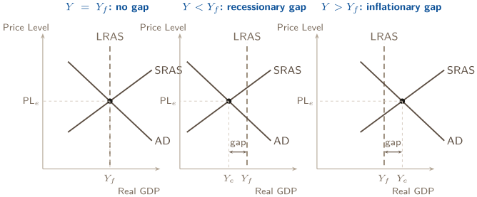
The College Board’s own suggested activity for this topic is to draw all three. The middle one is the recession; the right one is an economy running hot, and the exam expects you to know that “hot” is a gap too, not a success.
With equations. When AD and SRAS are given as lines, equilibrium is where they are equal: set the two expressions for real GDP equal, solve for the price level, substitute back for output, then compare output with for the gap. Problem 5 does exactly this.
2. USE BOTH OUTCOMES
A shock raises the price level and lowers real output in the short run. Which single-curve change is consistent with both observations?
6. SHOCKS IN THE SHORT RUN: FOUR PICTURES, AND THE TWO KINDS OF INFLATION
A shock is anything that shifts AD or SRAS. In the short run, read the new crossing of AD and SRAS and report three things: real GDP, employment (which follows output), and the price level.
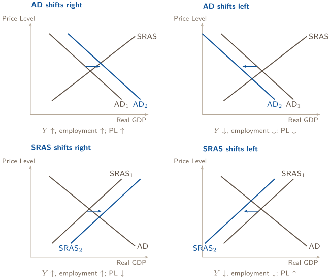
The rule the four pictures share. A demand shock moves output and the price level the same way. A supply shock moves them opposite ways. When a prompt tells you what happened to output and prices, that pair tells you which curve moved before you draw anything.
Two kinds of inflation.
- Demand-pull — AD shifts right; output and the price level rise together. Too much spending chasing the economy’s output.
- Cost-push — SRAS shifts left; the price level rises while output falls. Costs rose and firms passed them on. Falling output with rising prices has its own name, stagflation, and it is the picture at bottom right.
Employment always follows output. Unemployment moves the other way from both.
CHECK 2 — USE BOTH OUTCOMES
A leftward shift of short-run aggregate supply, and nothing else. Test the four candidates against both facts: AD right raises and raises ; AD left lowers both; SRAS right lowers and raises . Only SRAS left raises the price level while output falls. That pairing is stagflation, and it is the one combination a demand shift can never produce — which is why the exam uses it to test whether you read both outcomes or only one.
7. LONG-RUN SELF-ADJUSTMENT: THE ECONOMY WALKS HOME ON ITS OWN
Leave a gap alone and it closes — through wages. That sentence is the whole of topic 3.7, and the exam wants both halves of it drawn.
A recessionary gap closes from below. Output is short of , so unemployment sits above the natural rate. Workers competing for scarce jobs accept lower nominal wages when contracts renew; other input prices soften too. Costs fall, so SRAS shifts right. The economy slides down AD to a lower price level and a higher output until it is back on LRAS.
An inflationary gap closes from above. Output is beyond , so unemployment is below the natural rate. Firms bid for scarce workers, wages rise when contracts renew, costs rise, and SRAS shifts left. The economy climbs AD to a higher price level and lower output, back to .
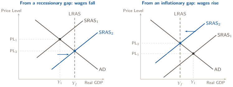
In both pictures AD never moves. Only SRAS does, and only because wages did. When you narrate the long run on the exam, that is the sentence that earns the point: unemployment above (below) the natural rate pushes nominal wages down (up), which shifts SRAS right (left) until output returns to full employment. Unemployment ends at the natural rate; the price level ends lower (higher) than where it started.
And LRAS itself. Self-adjustment moves the economy back to LRAS. A shift of LRAS is different: it is a change in — economic growth if right, a loss of capacity if left — and it moves SRAS with it.
8. FISCAL POLICY: THE GOVERNMENT’S TWO TOOLS, AND HOW TO SIZE THEM
Fiscal policy is the government’s use of its own spending and of taxes and transfers to move aggregate demand toward a macroeconomic goal, usually full employment. It is Congress and the Treasury, not the central bank (that is Unit 4’s monetary policy).
Direct and indirect. Government purchases are a component of AD, so a change in moves AD directly, dollar for dollar in the first round. Taxes and transfers change households’ disposable income, and households move AD indirectly by spending MPC of the change. That is why the spending multiplier is larger than the tax multiplier, and why the same dollar of policy does more as spending than as a tax cut.
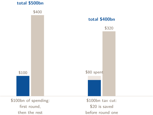
Sizing the policy. With an output gap of size :
Expansionary policy — more spending, lower taxes, higher transfers — shifts AD right to close a recessionary gap. Contractionary policy — less spending, higher taxes — shifts AD left to close an inflationary one. On the graph the policy is an AD shift; the short-run result is the new crossing with SRAS (card 6), and the price level moves with output.
Lags. Discretionary fiscal policy has to be recognized as needed, decided by a legislature, and implemented; by the time the spending arrives the gap may have changed. The CED names the lag and its cause in one line: the time it takes to decide on and implement a policy action. That sentence is a free-response point on its own.
3. NAME THE TRIGGER
Tax receipts fall during a recession under an unchanged tax law. Is that necessarily a new discretionary tax cut?
9. AUTOMATIC STABILIZERS: THE POLICY THAT NEEDS NO VOTE
Automatic stabilizers are features of the tax and transfer system already on the books that push against the business cycle without anyone deciding to act. The two the CED names:
- Tax revenues move with GDP. When output falls, incomes fall and so does the tax taken from them — disposable income falls by less than GDP did, so consumption falls by less, and the recession is shallower than the multiplier alone would make it. When output rises, revenues rise, consumption is restrained, and the boom is cooler.
- Transfer programs pay out when incomes fall. Unemployment insurance and similar social-service programs put spending power back into households exactly when the cycle is taking it away.
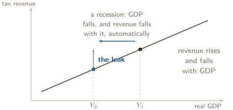
The leak is the point: with a proportional income tax, some of every lost dollar of income was tax the household never had to spend, so the cascade of card 2 is smaller in both directions. Problem 9 puts a number on it.
Not discretionary. The test for the exam: did anyone have to decide? A stimulus bill is discretionary fiscal policy, with the lags of card 8. Unemployment insurance paying out because claims rose is an automatic stabilizer — no new vote or policy decision is needed; administrative and effect lags may remain. Both are fiscal; only one is a choice.
CHECK 3 — NAME THE TRIGGER
No. With an unchanged tax code, receipts fall because incomes fell — the same rates applied to a smaller base. Nobody legislated anything; the tax system did it automatically, which is exactly what makes it a stabilizer rather than a policy. Discretionary fiscal policy requires a change in the law itself. The test is not whether the government’s budget moved, but whether anyone voted.
10. THE GRAPH THE EXAM SCORES
A correctly labeled AD–AS graph is a checklist, and the scorer runs it in this order. Draw in the same order and nothing is forgotten.
- 1.
- Axes: vertical Price Level (PL), horizontal Real GDP (or real output). Not and , not “Price” and “Quantity.”
- 2.
- Curves, each named: AD downward, SRAS upward, LRAS vertical. Label every one; an unlabeled line is not a curve.
- 3.
- Full-employment output: on the horizontal axis, where LRAS meets it.
- 4.
- The starting equilibrium: the crossing marked, its price level PL and output dropped to the axes.
- 5.
- The shift: the new curve drawn and named (AD, SRAS), an arrow showing direction.
- 6.
- The new equilibrium: PL and dropped to the axes, and — if the prompt asks for the long run — the second shift and the third point, back on LRAS.
Two habits that cost nothing. Write the subscripts in the order things happened, so a reader can follow the story without you. And when the prompt says “show,” the graph is the answer — the sentence beside it explains, but the points are on the picture.
The Problems — In Topic Order
Nine problems, one per topic, in the order the College Board lists them. Every scenario is fictional and original. Work each one before reading its solution.
PROBLEM 1
Aggregate demand: which component, which direction, and whether the curve moved at all
For each headline, name the component of aggregate demand it touches (, , or ), say whether aggregate demand shifts right, shifts left, or does not shift, and — where it does not — name the effect that describes the movement along the curve.
1. | “Household net worth falls 12% as home prices slide.” |
|---|---|
2. | “With the price level down 3%, families find their savings stretch further and spend more.” |
3. | “Congress passes a $60 billion highway program.” |
4. | “The dollar climbs 10% against its trading partners’ currencies as foreign investors seek a safe haven.” |
5. | “Expecting strong demand next year, manufacturers order new equipment.” |
6. | “A rising price level pushes interest rates up as households hold more money for everyday purchases; borrowing slows.” |
BEFORE YOU COMPUTE
Ask one question of each headline before anything else: is the cause the price level, or is it something else? If the price level is the cause, the curve does not move — the economy slides along it, and your job is to name which of the three effects (real wealth, interest rate, exchange rate) the headline is describing. If the cause is anything else, name the component that changed and the direction.
Headlines 2 and 6 are the ones that catch people, because they sound like spending changed — and it did, but because the price level changed. A change in spending caused by the price level is what the slope of AD already says. Two of the six are that.
WORKING
Apply the test to each:
| Component | AD | Why |
|---|---|---|---|
1. |
| shifts left | Wealth fell because asset prices fell, not because the price level rose. Households spend less at every price level. |
2. |
| no shift | The price level fell; savings buy more; spending rises. That is the real wealth effect — a movement down along AD. |
3. |
| shifts right | Government purchases are a component of AD; $60 billion more at every price level. |
4. |
| shifts left | The currency appreciated for its own reason (safe-haven flows). Exports dearer abroad, imports cheaper at home; net exports fall at every price level. |
5. |
| shifts right | Firms’ expectations improved; investment spending rises at every price level. |
6. | , | no shift | The price level rose, money demand rose, interest rates rose, borrowing fell. That is the interest rate effect — a movement up along AD. |
Notice that headline 4 describes an exchange rate moving, and card 1 lists an exchange rate effect among the reasons AD slopes down. They are not the same thing. The effect is the exchange rate moving because the price level moved; headline 4’s dollar moved because investors moved. Same variable, different cause, different picture.
ANSWER
1: , shifts left. 2: , no shift — the real wealth effect. 3: , shifts right. 4: , shifts left. 5: , shifts right. 6: and , no shift — the interest rate effect.
WATCH OUT
“Spending fell, so AD shifted left.” Not necessarily. Spending falls along the curve when the price level rises; that is what a downward slope means. The shift question is never “did spending change” but “did spending change at a given price level.” If the headline’s cause is the price level, you are describing the slope, not a shift.
The opposite error. Reading “the dollar strengthened” as the exchange rate effect and drawing no shift. The three effects are triggered by the price level, and only by it. When the cause is anything else — foreign investors, a central bank abroad — the curve moves.
CONNECTION
Headline 6 is the first half of a chain Unit 4 completes: a higher price level raises the demand for money, and in the money market that raises the nominal interest rate, which lowers interest-sensitive spending. When you draw the money market next unit, the interest rate effect is the reason the two diagrams talk to each other. And headline 1 is where Unit 2’s real wealth — assets measured against the price level — meets this unit’s curve.
ABOUT THIS EXCERPT
This is the opening of a 41-page guide: the diagnostic tree, the full Master Toolbox, and the first worked problem. 8 more problems follow in the complete guide, each worked the same way — what to notice before you start, every step shown, and the mistake that problem invites. The complete guide is shared with families during the fit conversation.
Engineering Confidence — engineeringconfidence.one
Source and review notes
What this resource is
Complete browser edition of the public excerpt from an original Engineering Confidence AP Macroeconomics packet aligned to the College Board framework effective Fall 2026. All numerical scenarios are fictional and original.
- Published
- Last reviewed
- Printable edition
- 18 pages
Course reference: official College Board course page.
Read this public excerpt above, or save the PDF for printing and offline reading.
Download the 18-page PDF excerpt