Read the public excerpt
The same instruction and worked examples appear here and in the printable PDF excerpt. You can request full guides for upcoming units below.
READ THIS FIRST
About this guide. Unit 1 is the toolkit the rest of AP Macroeconomics is built from, and it is tested that way: the production possibilities curve returns as the economy’s full-employment output, the supply-and-demand diagram returns as aggregate demand and aggregate supply, and the habit of labeling every axis, curve and point returns on every free-response question you will ever see. The College Board says in this unit’s own exam note that “many students lose points on the free-response section of the AP Exam for failing to properly label all the elements of a graph and demonstrate the effects of changes on graphs,” and that the other hard thing is “differentiating between movement along a curve and shifts of a curve.” Those two sentences are the unit.
Three things go wrong here, for nearly everybody:
- A correct graph with the labels missing. Axes unnamed, curves unnamed, the equilibrium floating with no price and no quantity marked to the axes. The economics is right and the points are gone, because on this exam the labels are the answer.
- “The price fell, so demand rose.” A price change moves you along a curve; only something other than the good’s own price moves the curve. One sentence, two different claims, and the exam scores the difference.
- Comparative advantage from output instead of opportunity cost. The country that makes more of everything does not have the comparative advantage in everything; it cannot. The answer is a ratio, with units, and the ratio is upside down half the time on the first try.
The pages that follow are your concept reference: a diagnostic decision tree and a Master Toolbox. You do not have to read every card before you start — open the one you need. Then work each problem before reading its solution; the “Before you compute” notes are there to catch you at the exact moment a wrong turn usually happens. What seven problems cannot do is give you enough repetitions: each is the clearest instance of its shape, so a problem you found easy is a signal to go find five more like it. Fluency is volume, and volume is homework.
Every topic in the unit, and where it lives. The College Board lists six; here is each one and the page that teaches it.
- 1.1 scarcity and economic resources — the first card (p. 11); Problem 1(a).
- 1.2 opportunity cost and the production possibilities curve — four cards (p. 12); Problems 1 and 2.
- 1.3 comparative advantage and gains from trade — two cards (p. 18); Problems 3 and 4.
- 1.4 demand — one card (p. 22); Problem 5.
- 1.5 supply — one card (p. 23); Problem 5.
- 1.6 market equilibrium, disequilibrium, and changes in equilibrium — two cards (p. 24); Problems 6 and 7.
WHERE THE POINTS GO ON THIS UNIT
The exam’s phrase is “correctly labeled graph,” and it means four things at once: both axes named, every curve named, the equilibrium marked and dotted to both axes, and any change shown as a second, labeled curve with the new equilibrium marked the same way. A graph with the economics right and two of those missing scores like a graph that is wrong. The last card of the toolbox shows what one looks like when it earns everything.
Movement or shift, in those words. “Quantity demanded rose” and “demand rose” are different sentences and the exam scores the difference: the first is a slide along a curve because the good’s own price changed, the second is the curve moving because something else did. Say which, and say what moved it.
The number, after the picture. On one 2025 free-response question, 70% of students drew the Phillips curve correctly and, on the very next part, 32% computed an unemployment rate. Unit 1 is where that habit starts: every diagram has arithmetic behind it — an opportunity cost read off a slope, a surplus read as at a stated price — and the exam asks for the number in the part after the picture. Draw it and run it, every time. In 2026, 66% of the cohort earned a 3 or higher and the bands were unusually even; no score is a safe assumption on this exam.
Comparative advantage is a ratio with units. “Kestrel gives up 5 tons of wheat per ton of steel” earns the point; “Kestrel makes more steel” does not, because it answers a different question. Write all four opportunity costs, with their units, before you name anyone’s advantage — and check that the two costs for each country are reciprocals, which they must be.
A surplus is a quantity. At a price above equilibrium, the surplus is at that price, in the units of the quantity axis — not the gap between two prices, and not “the market has too much.” The same for a shortage. Read both quantities off the two curves at the stated price, subtract, and say the units.
Diagnostic Decision Tree
HOW TO READ THE PROMPT
Run these in order, before touching a formula or a graph. Each one rules out whole families of tools.
1. What is on the axes? Two goods — a production possibilities curve, and the whole question is about a trade-off. Price and quantity of one good — a market, and the question is about where the curves cross and what moves them. Nothing on an axis yet, but two producers and two goods in a table — comparative advantage, and the axes come later.
2. On a PPC: a point, a cost, or a move? A point is classified by where it sits — inside (unemployment or misallocation), on (full employment), outside (unattainable today). A cost is read off the slope or the table: the other good given up per unit of this one, with units, and whether it grows as you go. A move is one of two different events: along the curve (the mix changed) or the curve itself (capacity changed). Growth is only the second.
3. Two producers, two goods: opportunity costs first, never outputs. Four ratios, with units; the lower cost holds the comparative advantage; the two costs for one producer are reciprocals, so if your answer gives one producer both advantages, the arithmetic is wrong. Terms of trade live strictly between the two costs for the traded good.
4. In a market: did the good’s own price change, or something else? Own price — a movement along the curve; the words are quantity demanded or quantity supplied. Anything else — income, a related good’s price, input costs, technology, expectations, the number of buyers or sellers — shifts a curve; the words are demand or supply. Name the determinant before you name the direction.
5. Which curve, which way — then price and quantity from the rule. A demand shift moves and the same way; a supply shift moves them opposite ways. Both curves shifting: one of the two is determinate from the directions alone and the other depends on the sizes, and “indeterminate, because…” is a full-credit answer when you say why.
6. A price is named that is not the equilibrium. Read and off the curves at that price. Above equilibrium, : a surplus of the difference, and the price falls. Below, : a shortage, and the price rises. What actually trades is the smaller of the two.
7. The verb. Draw a correctly labeled graph means axes, curves, the equilibrium dotted to both axes, and every change as a new labeled curve with a new marked equilibrium. Show means put it on that graph. Explain means the mechanism in a sentence — what changed, which curve, which way, and why the price and quantity followed. Calculate means the formula, the substitution, the number, the units.
Where to Look When You’re Stuck
FIND THE SENTENCE THAT SOUNDS LIKE YOUR SITUATION
The tree above is for a problem you are about to start. This table is for one you are already inside. Find your sentence, do the thing in the middle column, turn to the page on the right.
What is happening | First move | Where |
|---|---|---|
“I can’t tell whether this point is efficient” | Inside, on, or outside the curve — and inside means idle or misallocated resources, not a smaller economy. | p. 13, Prob. 1 |
“The opportunity cost keeps changing along the table” | That is the shape talking: increasing cost, a bowed curve, resources that are not equally good at both. Compute it at two places. | p. 14, Prob. 1 |
“Did the curve move, or the point?” | Ask whether capacity changed. Unemployment falling is a point moving toward the curve; new capital or workers is the curve moving. | p. 16, Probs. 1, 2 |
“The country that makes more of both” | has the absolute advantage in both and the comparative advantage in one. Compute the four opportunity costs. | p. 18, Prob. 3 |
“Which number goes on top?” | Output table: other over own. Input table: own over other. Or build the units chain and let the units decide. | p. 18, Probs. 3, 4 |
“What terms of trade work?” | Strictly between the two producers’ opportunity costs for the traded good; an endpoint leaves one side indifferent. | p. 20, Prob. 4 |
“The price fell and demand rose” | No — quantity demanded rose. A curve moves only when something other than its own price changes. | p. 22, Prob. 5 |
“Which curve does this event move?” | Name the determinant: the buyers’ side (income, tastes, related goods, expectations, number of buyers) or the sellers’ side (input prices, technology, expectations, number of sellers). | p. 23, Prob. 5 |
“Both curves moved and I can’t find the price” | One outcome is determinate from the directions alone; the other depends on the sizes. Say which, and why. | p. 24, Probs. 6, 7 |
“There’s a surplus — how big?” | at the stated price, in the quantity’s units. What trades is the smaller quantity. | p. 24, Prob. 6 |
“I drew it and lost the points anyway” | Axes, curves, the equilibrium dotted to both axes, the change as a new labeled curve with a new marked equilibrium. | p. 25, Prob. 7 |
If none of those is your sentence, the last section of this guide is the longer version, organized by what went wrong.
Master Toolbox — Everything These Problems Use
Use these cards as you work. Name the decision you need to make, then open the relevant card. Each card stands on its own; you do not need to read the whole toolbox before attempting a problem.
1. THE TASK VERB SETS THE RESPONSE JOB
The official verbs describe what a complete response must do.
Identify / What / Which | Supply the requested information. No elaboration is required unless another part asks for it. |
|---|---|
Explain | State how or why the outcome occurs, using reasoning — the mechanism, in a sentence. A number or a graph can be part of it; neither replaces it. |
Calculate | The formula, the substitution, the number, the units. |
Draw a correctly labeled graph | Axes named, curves named, the equilibrium marked to both axes. |
Show | Put the change on the graph you drew: a second labeled curve, and the new equilibrium marked the same way. |
2. SCARCITY, RESOURCES, AND WHAT “FULL EMPLOYMENT” MEANS ON A GRAPH
Resources — the factors of production — are what an economy has to work with: land (natural resources), labor (human effort), capital (tools, machines, buildings: things made in order to make other things), and, in most courses, entrepreneurship, the organizing and risk-taking that combines the rest. Follow the convention a prompt establishes.
Scarcity is the condition that resources are limited while wants are not, and it is why every society has to choose: what to produce, how, and for whom. It is not a shortage — a shortage is a market at the wrong price, and it goes away when the price moves. Scarcity never goes away; it is the reason the subject exists.
The macro reading. For a whole economy, “every scarce resource at work” has a name: full employment. That is exactly what a point on the production possibilities curve means, and it is why the College Board’s own description of this unit’s first big idea is that the PPC “is used to demonstrate the full employment level of output.” A point inside the curve is an economy with idle resources — unemployed workers, silent factories — and Unit 2 will measure that idleness as an unemployment rate and an output gap. The picture in this unit and the numbers in the next are the same fact.
A trade-off is what scarcity produces at the level of one decision: to have more of one thing you must accept less of another. Put a number on the trade-off and you have an opportunity cost, which is the next card.
3. OPPORTUNITY COST — THE DEFINITION, AND THE RATIO WITH UNITS
The opportunity cost of a choice is the value of the next-best alternative you gave up to make it. Not everything you gave up — the next-best thing. A country that builds a dam gives up the best other use of that concrete, labor and land, once, not every use it can imagine.
On a PPC and in a comparative-advantage table, opportunity cost is a ratio: the amount of the other good surrendered per unit of this one. The units are the whole answer. “The opportunity cost of a machine tool is 2” means nothing; “the opportunity cost of one thousand machine tools is 2 million consumer units” is a claim someone can check. Write the sentence in that shape every time:
The two costs are reciprocals. If a thousand machine tools cost 2 million consumer units, then a million consumer units cost half a thousand machine tools — per million, the flip of . That is not a coincidence; it is the same trade read from the other side, and it is the check that catches an upside-down ratio before it costs a point.
4. THE PRODUCTION POSSIBILITIES CURVE: READING A POINT
A production possibilities curve (PPC) shows every combination of two goods an economy can produce when all of its resources are fully employed and its technology is fixed. In macroeconomics the two goods are usually capital goods and consumer goods — the choice between building for tomorrow and consuming today — because that is the choice that decides how fast the curve itself moves, which is card 6.
Where a point sits relative to the curve is the whole of the reading.
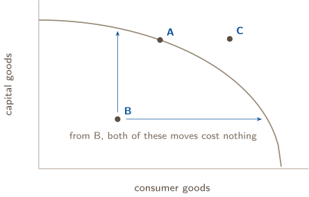
A | On the curve — full employment, efficient. Every resource is employed and employed well. From here, more of one good is available only by accepting less of the other: the trade-off is live, and the opportunity cost is positive. |
|---|---|
B | Inside the curve — attainable, inefficient. Resources are idle or misallocated: this is the economy in a recession, with unemployed workers and unused capacity. The two blue arrows are the diagnostic signature — from B the economy can have more of either good without giving up any of the other, so those moves have zero opportunity cost. That is what “unemployment is waste” means on a graph. |
C | Outside the curve — unattainable. Not with today’s resources and today’s technology. No reallocation reaches it; the curve itself has to move. |
5. THE SLOPE’S MAGNITUDE IS THE OPPORTUNITY COST — SO THE SHAPE IS THE STORY
Moving rightward along a downward-sloping PPC, the numerical slope is negative while opportunity cost is a positive amount forgone, so
when the axes increase in the usual directions. The curve’s shape is a statement about how that magnitude behaves.
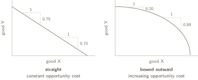
Both panels show the same measurement taken twice: advance one unit along the horizontal axis, read how far the curve falls. The straight PPC drops the same amount in both places; the bowed one drops further the second time, which is what “each additional X costs more Y than the one before” looks like.
Why an economy’s PPC bows outward. Because its resources are not equally suited to both goods. Start at the top, making only capital goods. To make the first consumer goods, you move over the workers and land that were worst at machine tools and best at food — you lose almost no capital output. Keep going and you run out of those, so you start moving resources that were genuinely good at capital goods, and each one costs more. The bow is what specialized resources look like when you plot them. It is the common case for a whole economy, not an AP default: compute the cost at two places and let the numbers say the shape.
When a PPC is straight, the resources are perfectly adaptable between the two goods, and the trade-off never changes — the case every comparative-advantage table in this unit assumes. The Course and Exam Description also names a third case, decreasing opportunity cost, a curve bowed inward; you will meet it rarely, and if a table hands you a falling cost, draw the shape you find.
A check first. One question opens three of the cards below and is answered at that card’s end. Answer it before you read on. Getting it wrong is the point — that is what makes the card stick.
1. DISTINGUISH GROWTH FROM RECOVERY
An economy moves from an interior production point to its unchanged frontier. What improved, and what has not yet been shown?
6. MOVEMENT ALONG THE CURVE, A SHIFT OF THE CURVE, AND THE CHOICE THAT MOVES IT
These are different events with different causes, and the exam’s own note on this unit says students confuse them. A graph that moves the curve when only the mix changed makes a different economic claim from the one in the prompt.
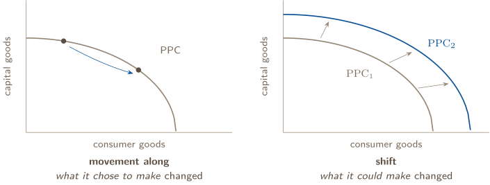
Movement along = the economy reallocated resources it already had. The curve does not move, and the move has a real opportunity cost — the point slides down one axis as it slides up the other.
Shift = the economy’s capacity changed. Outward: more or better resources (a larger workforce, new capital, discovered land), better technology or productivity. Inward: a disaster, a war, a workforce leaving. Outward is economic growth; inward is contraction. This is the CED’s own list — “changes in factors of production as well as changes in productivity/technology.”
A move from inside the curve to the curve is not growth. Idle workers going back to work takes the economy from a point like B to the frontier. Output rises, and nothing about capacity changed: the curve is where it was. The exam likes this one in a sentence — “the economy moved from inside its PPC to a point on it” describes falling unemployment, and the correct name is a recovery or a move toward full employment, never economic growth. Growth is the curve itself moving out.
The shift that only moves one axis. A better wheat variety helps consumer goods and does nothing for machine tools: the consumer-goods intercept moves out, the capital-goods intercept stays. The curve pivots. Ask: could the economy now make more of the good on the other axis than before? If not, that intercept does not move.
The choice on this year’s curve decides next decade’s curve. Capital goods are resources for the future — every machine tool built this year is a factor of production next year. So an economy that chooses a point high on the capital-goods axis today is choosing a bigger outward shift tomorrow, and it pays for that with consumer goods it does not have now. That is the macro question hiding in every PPC in this unit, and it is Problem 2.
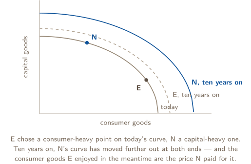
CHECK 1 — DISTINGUISH GROWTH FROM RECOVERY
What improved is the use of resources: the economy was inside its curve, wasting capacity, and is now on it. That is a movement to the frontier, not a movement of it. Growth is the curve itself shifting outward, and nothing here has shown more resources, better technology or more capital. On a graph the difference is total: one point moves, or the whole line does.
2. FIND THE COMPARATIVE ADVANTAGE
With the same resources, A can make 90 grain or 30 textiles; B can make 30 grain or 15 textiles. Who has comparative advantage in grain?
7. ABSOLUTE ADVANTAGE, COMPARATIVE ADVANTAGE, AND WHICH NUMBER GOES ON TOP
Absolute advantage — who can produce more of a good with the same resources (or one unit of it with fewer resources). A comparison of productivity, one good at a time.
Comparative advantage — who gives up less to produce it. A comparison of opportunity costs. This is the one that decides who should specialize in what, and the only one that determines the pattern of trade.
A country can be better at making everything and still should not make everything, because its resources spent on one good are resources not spent on the other, and that forgone output is the real cost.
THE RULE
Compare opportunity costs, never outputs. The producer with the lower opportunity cost for a good has the comparative advantage in it and should specialize in it.
Output table — “per worker-year, Kestrel makes 8 tons of steel or 40 tons of wheat.” Fix the resource, compare the goods:
— five tons of wheat per ton of steel. The other good’s output goes on top: other over own.
Input table — “a solar panel takes 6 hours, a bicycle takes 3.” Fix the good, compare the resource each consumes:
Now the own good’s input goes on top — own over other, exactly reversed.
You do not have to memorize which is which. Build the units chain and the units settle it:
Hours cancel; bicycles per panel survives. Set the second fraction up so the resource cancels, and there is only one way the numbers can go. Problems 3 and 4 are the same question in both formats.
The third format: two PPC graphs. An intercept is an output table in disguise — how much of one good the country makes when it makes nothing else — so the opportunity cost of the good on the horizontal axis is the vertical intercept over the horizontal one, the slope’s magnitude, and the comparative advantage in that good goes to the flatter curve.
Two checks that catch every wrong answer. In a two-country, two-good problem with different opportunity costs, each country has the comparative advantage in exactly one good — the costs are reciprocals, so if mine is lower in steel, yours is lower in wheat. An answer that gives one country both is an arithmetic error. And if the two countries’ opportunity costs are identical, neither has a comparative advantage in anything and there are no gains from trade; the exam does hand out that table, and the right answer is that no mutually beneficial trade exists.
CHECK 2 — FIND THE COMPARATIVE ADVANTAGE
A. Write the costs with their units before naming anyone: for A, one grain costs textile; for B, one grain costs textile. A gives up less to make grain, so A has the comparative advantage in grain — and B, giving up grain per textile against A’s , has it in textiles. A makes more of both, and that is absolute advantage, which decides nothing.
8. TERMS OF TRADE, AND CONSUMING BEYOND YOUR OWN CURVE
Autarky means no trade — each country consumes only what it makes. Terms of trade is the exchange rate two countries agree on: how many bicycles change hands per solar panel.
Nobody trades to be worse off, so each side has a walk-away number, and both are opportunity costs the country already knows: the exporter of panels will not accept fewer bicycles than a panel costs it at home (its cost is the floor); the importer will not pay more bicycles than a panel costs it at home, because it would just make its own (its cost is the ceiling). For both to gain strictly:
— simply between the two countries’ opportunity costs for that good. At an endpoint one side gains nothing and is indifferent; outside the range one side refuses. A range of 2 to 5 bicycles per panel is the same range as to panels per bicycle: reciprocals, inequality flipped. Say which good you are pricing.
Gains from trade. When each country specializes according to comparative advantage and trades inside the range, both can consume a bundle outside their own PPC. Neither curve moved — production possibilities are what they were — but consumption possibilities grew. Specialization and exchange do not make anyone more capable; they stop capable resources being spent on the wrong things.
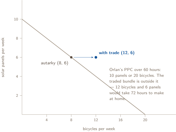
Complete or partial? With a straight-line PPC — as in the trade examples in this unit — the cost is constant, so a country with the comparative advantage keeps it at every quantity and specializes completely. On a bowed curve its cost rises as it specializes, and it stops where its cost climbs to its partner’s: partial specialization. The exam works with the straight case.
3. CLASSIFY THE EVENT
In a wheat market, wheat’s own price falls. Is that a demand-curve shift? What if consumer income changes instead?
9. DEMAND: THE LAW, THE REASONS, AND WHAT MOVES THE CURVE
The law of demand. Other things equal, a higher price of a good lowers the quantity of it demanded; a lower price raises it. This is a movement along the demand curve, and the thing that changes is called quantity demanded.
Why the curve slopes down. The substitution effect: when the price rises, other goods look cheaper by comparison and buyers move toward them. The income effect: at a higher price a given income buys less, so buyers can afford less of everything, this good included. Either answers “explain why the demand curve is downward sloping.”
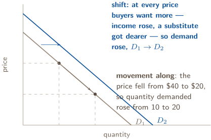
What shifts demand. Anything other than the good’s own price that changes how much buyers want at every price. Right when they want more at each price; left when they want less.
income | for a normal good, more income shifts demand right; for an inferior good (bus rides, store-brand staples), more income shifts it left — the CED’s own example of a determinant |
|---|---|
tastes and preferences | a fashion, a health finding, a season — right or left as buyers turn toward or away from the good |
prices of related goods | a substitute’s price rising shifts this good’s demand right; a complement’s price rising shifts it left |
number of buyers | more buyers, more demand at every price |
expectations | a price cut expected next year shifts demand left now; an expected shortage shifts it right now |
The one thing that never shifts demand: the good’s own price. A price change moves the buyer along the curve that is already there. “The price fell, so demand rose” describes a shift that did not happen; the sentence that scores is “the price fell, so quantity demanded rose.”
CHECK 3 — CLASSIFY THE EVENT
No. The good’s own price is the one thing that never shifts its own demand curve — it moves you along the curve, and the sentence that scores is “quantity demanded rose.” Income is a different matter: it is not the good’s own price, so it shifts the whole curve, right for a normal good and left for an inferior one. The test is always the same: was it the price of this good, or was it something else?
10. SUPPLY: THE LAW, AND WHAT MOVES THE CURVE
The law of supply. Other things equal, a higher price raises the quantity supplied; a lower price lowers it — a movement along an upward-sloping supply curve. Read vertically, the supply curve is a cost curve: at each quantity its height is the least a seller would accept for that unit, because that is roughly what the unit costs to make, and each additional unit costs more to coax out of a fixed set of resources — the same increasing cost the PPC’s bow was showing.
What shifts supply. Anything other than the good’s own price that changes what sellers will offer at every price. Right when producing is cheaper or easier; left when it is costlier.
input prices | cheaper labor, materials or energy shifts supply right; dearer inputs shift it left — the CED’s own example of a determinant |
|---|---|
technology and productivity | a better method makes each unit cheaper: right |
number of sellers | more firms, more supply at every price |
prices of other goods the seller could make | if wheat pays better, corn supply shifts left — the seller’s own opportunity cost |
expectations | a seller expecting a higher price next season holds back now: left now |
taxes and subsidies | a per-unit tax raises the cost of every unit: left; a subsidy lowers it: right |
And the one thing that never shifts supply: the good’s own price. A higher price moves sellers along the curve — quantity supplied rises. “Supply rose because the price rose” is the same error as its demand-side twin, and it is scored the same way.
11. EQUILIBRIUM, DISEQUILIBRIUM, AND CHANGES IN EQUILIBRIUM
Equilibrium is the price at which quantity demanded equals quantity supplied — the market clears: every buyer willing to pay the price finds a seller, every seller willing to accept it finds a buyer, and there is neither a shortage nor a surplus.
Finding it. From two schedules, scan for the price where the quantities match. From two equations, set them equal and solve: with and , gives and . Check by putting into both equations; if they disagree, the algebra slipped.
A price that is not the equilibrium price. Above it, sellers offer more than buyers take: a surplus of , and unsold goods push the price down. Below it, buyers want more than sellers offer: a shortage of , and unmet buyers bid the price up. Market forces drive the price back to equilibrium. Read and off the two curves at the stated price; the difference is the surplus or shortage, in the quantity’s units, and the smaller of the two is what actually trades.
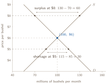
One curve shifts. Four cases, and each has a determinate answer for both price and quantity.
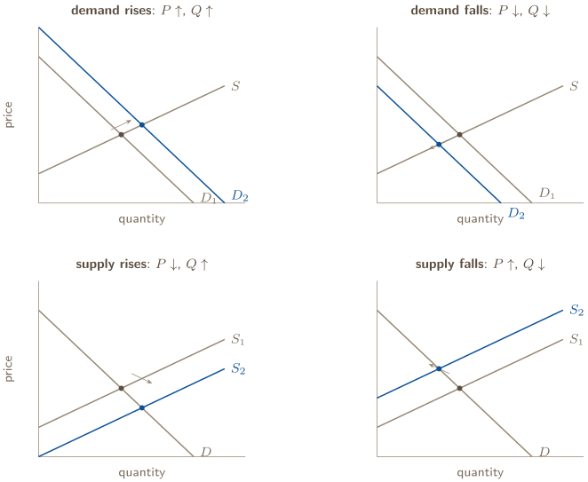
Read them as a rule rather than four pictures: a demand shift moves price and quantity the same way; a supply shift moves them opposite ways. Which way is decided by whether the curve moved right or left.
Both curves shift. Now one of the two outcomes is determinate from the directions alone and the other depends on how far each curve moved.
shifts | quantity | price |
|
|---|---|---|---|
right, right | rises | indeterminate | both push up; they pull opposite ways |
left, left | falls | indeterminate |
|
right, left | indeterminate | rises | both push up; they pull opposite ways |
left, right | indeterminate | falls |
|
On the exam, “indeterminate” is a full-credit answer when you say why: “price could rise, fall, or stay the same, depending on the relative sizes of the shifts.” Guessing a direction is the way to lose the point. If the prompt gives magnitudes, the numbers decide; Problem 6(e) is a case where they land the quantity exactly where it started.
12. THE CORRECTLY LABELED GRAPH
A correctly labeled graph must communicate the model and the requested change. Use the checks below to make it readable; the question’s rubric determines which features earn credit.
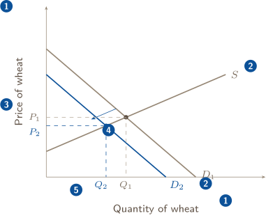
1 | Both axes named, with the good — “Price of wheat,” “Quantity of wheat.” A bare and is often accepted; an unnamed axis is not. |
|---|---|
2 | Every curve named, and named as what it is: and , or and when there are two. A curve with no name is a line. |
3 | The equilibrium marked and dotted to both axes — on the price axis, on the quantity axis. A dot at the crossing with nothing on the axes is the most common way to lose this point. |
4 | The change shown as a new, labeled curve, with an arrow for the direction. Redrawing the same curve in a new place with no new name is not a shift. |
5 | The new equilibrium marked the same way: and , dotted to the axes, so the reader can see which way each moved. |
For a PPC the same rule applies with the goods on the axes: name both goods, name the curve (, ), and mark any point the question asks about with its coordinates. Problem 7 is a full free-response graph worked against this list.
PROBLEM 1
Reading an economy’s production possibilities curve: points, costs, and moves
The Republic of Aldana produces two kinds of output: capital goods, measured in thousands of machine tools per year, and consumer goods, measured in millions of units per year. With every resource employed and today’s technology, it can produce these combinations:
| A | B | C | D | E | F | |
|---|---|---|---|---|---|---|
| capital goods (thousand machine tools) | 0 | 10 | 20 | 30 | 40 | 50 |
| consumer goods (million units) | 100 | 95 | 85 | 70 | 45 | 0 |
(a) Explain, in two sentences, why Aldana must choose at all: define scarcity and name the resources that are scarce here. (b) Last year Aldana produced 20 thousand machine tools and 60 million consumer units (point X). Classify X, and also Y and Z , relative to the curve, and say what each position means for the economy. (c) Calculate the opportunity cost of the first 10 thousand machine tools and of the last 10 thousand, with units. What shape is the curve, and why does an economy’s curve have that shape? (d) For each event, say whether it is a movement along the curve or a shift of the curve, give the direction, and draw a correctly labeled graph for any shift, naming the original curve and the new one : (i) a drought cuts farm output, and consumer goods only, by a fifth; (ii) Aldana’s unemployment rate falls from 9% to 5%; (iii) a new generation of machine tools raises productivity in every industry; (iv) a wave of immigration enlarges the labor force.
BEFORE YOU COMPUTE
Rung 1: two goods on the axes, so this is a PPC and every part is about a trade-off. Rung 2 sorts the parts — (b) is points, (c) is a cost, (d) is moves. Before (c), decide what “the first 10 thousand tools” means on the table: the step from A to B. Before (d), say for each event whether capacity changed — that one question separates the two kinds of move, and it is the question the College Board says students get wrong.
Write the opportunity cost as a sentence with units in it. “5” earns nothing; “5 million consumer units per 10 thousand machine tools” earns the point and lets you check the direction.
WORKING
(a) Scarcity is the condition that resources are limited while wants are not, and it forces a choice because every worker, hectare and machine used to make tools is one not used to make consumer goods. The scarce resources here are Aldana’s land, labor, and capital — the factors of production the table holds fixed. If they were unlimited, the table would have no far edge.
(b) Read each point against the row above it.
X . At 20 thousand tools the curve allows 85 million consumer units; X has 60. Inside the curve: attainable but inefficient. Resources are idle or misallocated — this is Aldana in a recession, with unemployed workers and unused plant, which is why part (d)(ii) will move this point without moving the curve.
Y . Exactly point D. On the curve: full employment, efficient. From here more tools cost consumer goods, and the cost is the slope.
Z . At 40 thousand tools the curve allows 45 million consumer units; Z asks for 70. Outside the curve: unattainable with today’s resources and technology. No reallocation reaches it; the curve itself would have to move.
(c) The first 10 thousand tools, A to B: consumer goods fall from 100 to 95.
that is, 5 million per 10 thousand. The last 10 thousand, E to F: consumer goods fall from 45 to 0.
that is, 45 million per 10 thousand. The cost rose nine-fold across the table — million per step — so opportunity cost is increasing and the curve is bowed outward. An economy’s curve has that shape because its resources are not equally good at both goods: the first machine tools are made by the workers and plants that were worst at consumer goods and best at tooling, so almost no consumer output is lost; the last are made by farms and food plants pressed into service, and each costs a great deal.
(d) Capacity or mix?
(i) A drought cuts consumer-goods output by a fifth. Capacity changed, in one good only: a shift inward on the consumer-goods axis — every combination’s consumer output falls to 80% of what it was (100 becomes 80, 95 becomes 76, and so on) while the tools intercept stays at 50. The curve pivots, not slides.
(ii) Unemployment falls from 9% to 5%. Nothing about capacity changed — the same workers and plants exist; more of them are working. A movement from inside the curve toward it: X moves up toward the frontier. This is a recovery, not growth, and the curve does not move.
(iii) Better machine tools raise productivity everywhere. Capacity changed in both goods: an outward shift of the whole curve, both intercepts moving. Economic growth.
(iv) Immigration enlarges the labor force. More of a factor of production: an outward shift, both intercepts, the same picture as (iii) with a different cause.
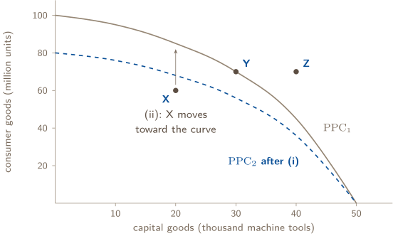
The shifts in (iii) and (iv) are the whole curve moving out — the right-hand panel of card 6, with outside at both ends.
ANSWER
(a) Resources — land, labor, capital — are limited while wants are not; using them for tools means not using them for consumer goods. (b) X inside (attainable, inefficient: idle resources); Y on the curve (full employment, efficient); Z outside (unattainable today). (c) First 10 thousand tools: 0.5 million consumer units per thousand tools; last 10 thousand: 4.5 million per thousand. Increasing opportunity cost, bowed outward, because resources are specialized. (d) (i) shift inward on the consumer-goods axis only (a pivot); (ii) movement from inside toward the curve, not a shift; (iii) and (iv) outward shifts of the whole curve.
WATCH OUT
The expensive error is in (d)(ii): calling falling unemployment “economic growth” and drawing the curve moving out. Output rose, so it feels like growth, but capacity did not change — the workers who went back to work existed before. The graph that earns the point moves the point, from inside the curve toward it, and leaves the curve where it was. Growth is the curve.
Two smaller ones. In (c), a cost without units — “the opportunity cost is 4.5” — is not an answer, and a cost written upside down ( thousand tools per million consumer units) is the right number for the wrong question; the sentence with the units in it is how you notice. And in (d)(i), moving both intercepts inward claims the drought hurt machine-tool capacity too; ask whether Aldana could still make 50 thousand tools if it made nothing else. It could. That intercept stays.
CONNECTION
Point X is the picture Unit 2 will measure. An economy inside its curve has an unemployment rate above its natural rate and a negative output gap — actual output below potential, where potential output is the curve itself. Unit 3 draws the same fact a third way, as real GDP to the left of the full-employment line in the aggregate demand and supply model. Three diagrams, one condition; learn to see the recession in each.
ABOUT THIS EXCERPT
This is the opening of a 42-page guide: the diagnostic tree, the full Master Toolbox, and the first worked problem. 6 more problems follow in the complete guide, each worked the same way — what to notice before you start, every step shown, and the mistake that problem invites. The complete guide is shared with families during the fit conversation.
Engineering Confidence — engineeringconfidence.one
Source and review notes
What this resource is
Complete browser edition of the public excerpt from an original Engineering Confidence AP Macroeconomics packet aligned to the College Board framework effective Fall 2026. All numerical scenarios are fictional and original.
- Published
- Last reviewed
- Printable edition
- 23 pages
Course reference: official College Board course page.
Read this public excerpt above, or save the PDF for printing and offline reading.
Download the 23-page PDF excerpt